Background
Patients desperately want to reduce their waiting time physically at a hospital.
Hospitals in big cities in Vietnam are also overwhelmed by a large number of patients, thus looking for a way to optimize the treatment process.

Design Process

Process
Phase 1: Research
We started with understanding the root causes of the long waiting time at a hospital.
1.1. We sent out a survey to identify the main patients’ concerns
We surveyed patients of different ages in Vietnam, and we learned that 82.6% of them agreed that overcrowding and waiting time are the main concerns when going to a hospital.

1.2. Conducted interviews to understand the root causes
We interviewed 8 people in Vietnam to understand the pain points behind overcrowding and long waiting time.

We figured out that:
- Over-crowding happens because most patients want to visit well-know hospitals.
- Long waiting time occurs due to the downtime between steps in the treatment process.
1.3. Competitor analysis
After gaining empathy with patients in Vietnam, we examined the current digital healthcare solutions in the Nordics and Vietnam.

Things that these apps have in common:
- All apps provide these basic features: book appointments with doctors, calendar, history, patient profile, in-app payment, and FAQ.
- All apps are mobile native apps.
Things that these apps can improve:
- Healthcare apps in Vietnam should create their own databases of existing patients, so when the patients register to use the app, the app will automatically import the patient data → patients in Vietnam need to fill in a lot of paperwork.
- Apps in Vietnam should improve their user interfaces and performances. The current UIs are old-fashioned, and the apps still contain a lot of bugs → patients are not willing to adopt new technology solutions.
From the analysis, we learned that outdated UIs and the limitations of the healthcare system in Vietnam could be the reasons causing unsatisfied patients' experiences.
Phase 2: Define
After the research, we went deeper to understand the users’ problems in specific contexts.
2.1. Defined the target user persona
With the information we collected, we formed our primary user persona with behavioral considerations, frustrations, and goals.

2.2. Create a user journey
We divided the journey into four phases:
- When patients reserve an appointment with doctors physically at a hospital
- When patients go around a hospital to do lab tests
- When patients come back to meet doctors after finishing the lab tests
- When patients buy medicines inside a hospital.

2.3. Select the approach to solving the problem
To select what features we should have in our app, we started by coming up with strategic approaches to the solution.

In the end, we selected approach one - A mobile app that is fully customized for a specific hospital.
Why we use that approach:
- To solve the problem, we decided to approach the solution from a holistic view. Instead of improving patients' experience in specific moments when they are at hospitals, we examined the whole patient's journey from coming to leaving the hospital.
- We assumed that digital transformation would be doable for hospitals.
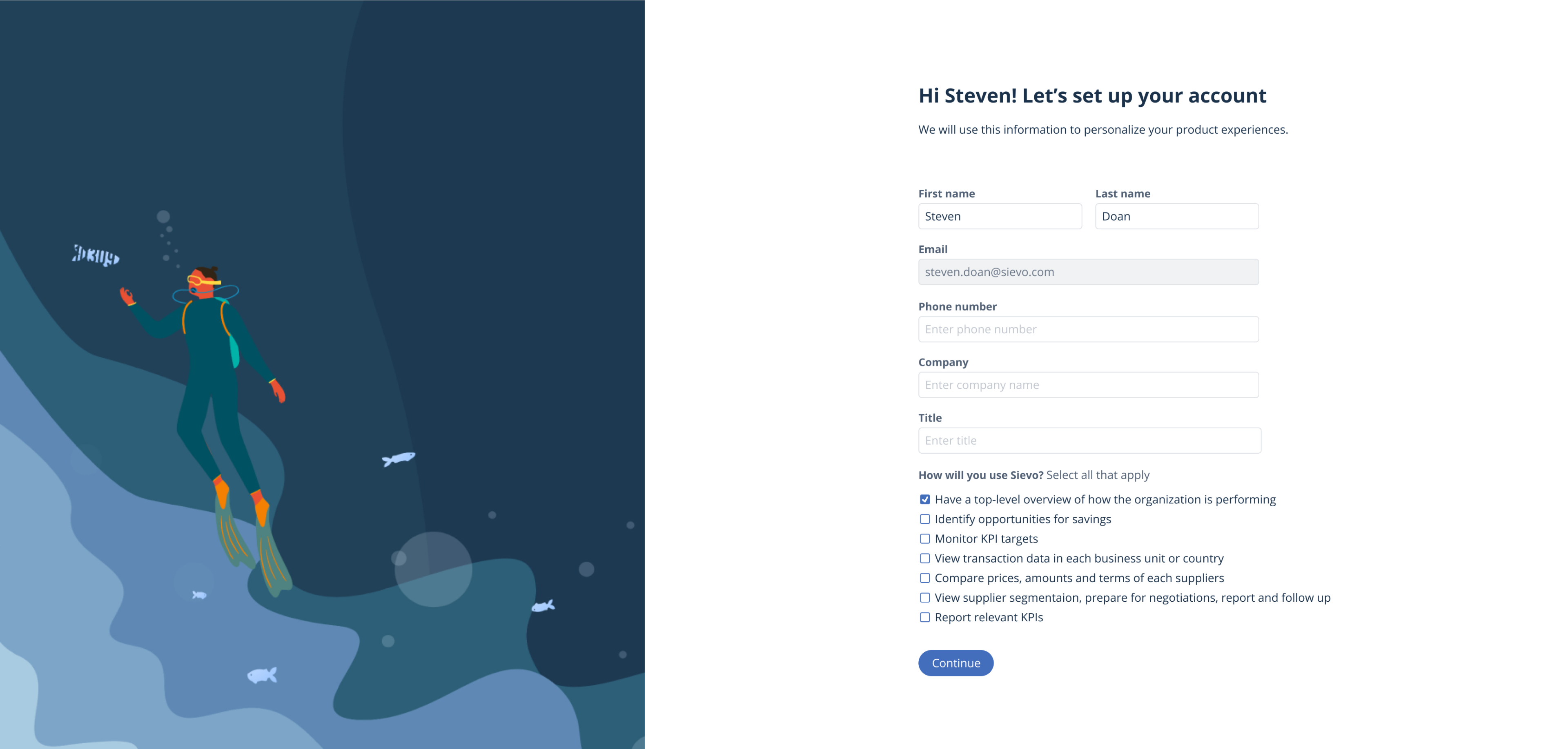
Phase 3: Wireframes and testing
We ideated and tested the early concept of the solution.
3.1. App Features & Value To Users
After user research and ideation, we mapped out key features that can help patients enhance their experiences and reduce unnecessary waiting time at the ACD hospital in Vietnam.

3.2. Low-fidelity wireframes
First, we began drawing the user flow in the mobile app.

Second, we created a sitemap to structure our app content.

Third, we made different low-fidelity wireframes based on the user flow and sitemap.
.png)
3.3. User testing on low-fidelity wireframes
We tested the wireframes with 8 users to understand how easy to use the app, and we got some feedback below:
- Most users wonder why they have to pay upfront when booking. Can they pay after they meet the doctor? Can they pay by cash?
- The user may have no idea which doctor to choose when they book an appointment.
- There're too many things on the Homepage, while News + Search is not necessary. News should be changed to Information.
- The "Done check up” and “Done the test" buttons are not necessary because they create more work for the users. The process after scanning the bar code should be automated.
We used this feedback to improve our high-fidelity prototype.
Phase 4: Prototypes and testing
We improved our design based on the feedback and visualized the concept in high fidelity.
4.1. Designs of phase 1 in the user journey
Patients book an appointment with doctors.

4.2. Designs of phases 2, 3, and 4 in the user journey
Patients take lab tests, Patients receive the diagnosis from doctors, and Patients buy medicine.
.png)
4.3. Success measure
We tested 8 users who we interviewed in the Research phase with our high-fidelity prototype to measure whether we succeeded in solving the users' problems.
Here are the results:
- 8/8 users believed the app could help them utilize the waiting time more effectively.
- 6/8 users believed the app could reduce their waiting time at a hospital, but most of them are skeptical whether the waiting time will be reduced significantly.
- 6/8 users felt that they would be interested in using this app if this app goes live with the current features.
- 2/8 users above the middle-aged are skeptical about our solution.
We realized that young working professionals would be the early adopter of the solution, and this concept does solve the patients' problems!
Result
A mobile app concept that digitizes most physical services at a hospital, including booking multiple appointments and buying medicine.
Lessons Learned
#1: Combine qualitative & quantitative user research
I learned how to combine survey and interview techniques to get user insight efficiently. For example, in this project, I learned to launch a survey to get general ideas, then conduct user interviews to define the root causes.
#2: Create a user journey
I learned to properly create a user journey and how to get actionable insight from it. Also, I could explain the differences between a user journey and a user flow.
#3: Design complex user flows
Users could experience a lot of interactions and flow on the app. Thus, I learned how to create a good information architecture so that users can navigate to find necessary information quickly.