Background
The company wants to provide easy-to-understand insights to help their users, Account Payable (AP) managers, make the invoice matching process fully automated.
Invoice matching is the complex process of comparing information on invoices with information in internal documents, e.g., purchase orders or goods receipts. When all information is matched, invoices can proceed to payment.
- As a user, AP managers want to have visibility into the matching process and how to make the process fully automated.
- As a business, the company wants to provide its customers with insight to increase the matching automation rate, which increases the value of its software.
Co-design process
Process
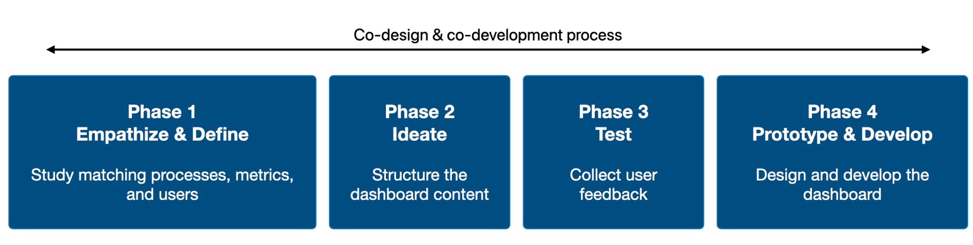
Phase 1: Study matching processes, metrics, and users
Each metric and its value to users must be carefully considered when designing a dashboard.
The primary design challenge is that most terminologies are new to the users and even our product team.
For example, the image below shows how the touchless match rate is defined.
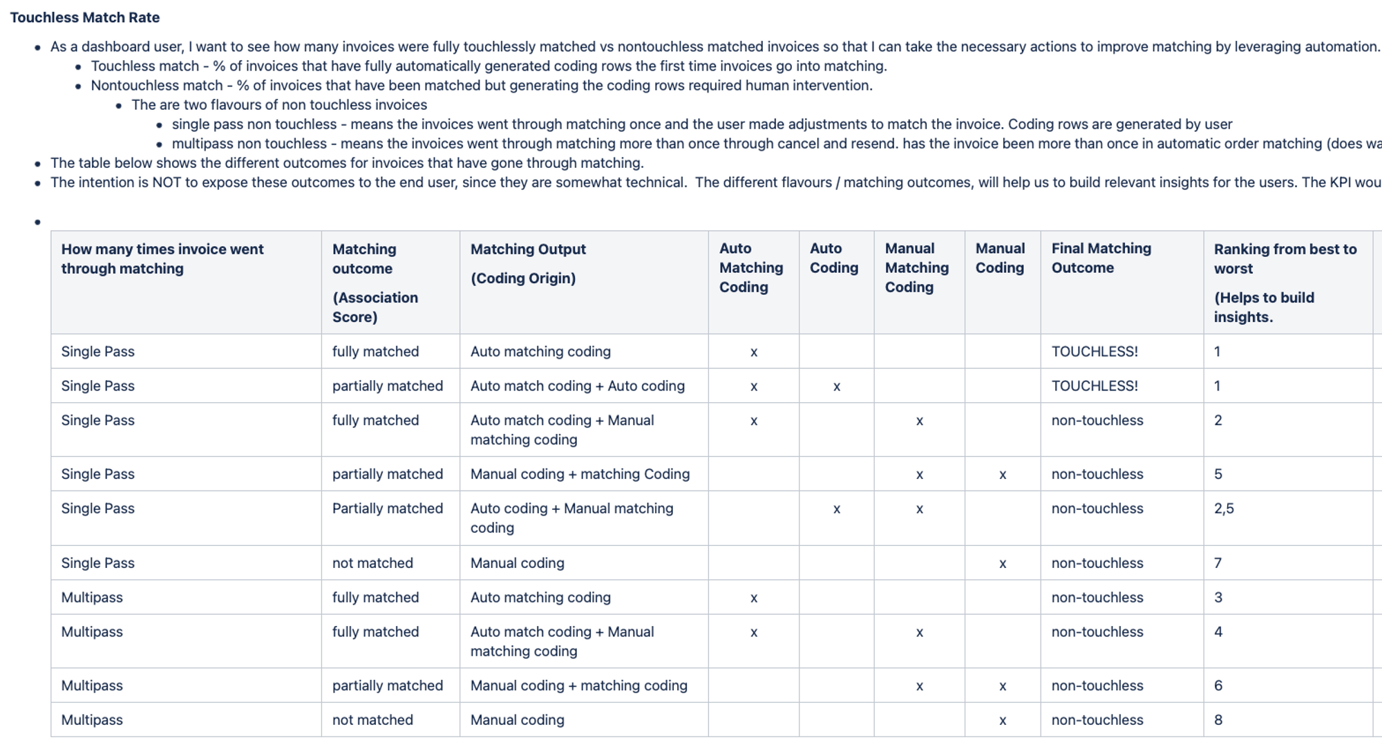
If I want to make these terms easy-to-understand to users, I must understand how the metrics are calculated and how they provide value to users.
First, I studied the workflow and daily responsibilities of the AP manager, the primary users. To do that, I read many job descriptions on LinkedIn and articles about AP managers. Then, I tried to find patterns to create a persona of an AP manager and understand how they may use the dashboard in their current workflows.
Second, I developed a new framework Decisions-Questions-Metrics based on a Jobs-to-be-done framework to see the metrics from users’ perspectives.
- Decisions: What decisions does this dashboard support users to make?
- Questions: What questions do users need to answer to make the decision?
- Metrics: What are metrics that help users answer the question?
One product owner told me that I could understand the complex matching process that took him a year to understand.
Phase 2: Structure the dashboard content
Wireframes were iterated 8 times to structure the dashboard content.
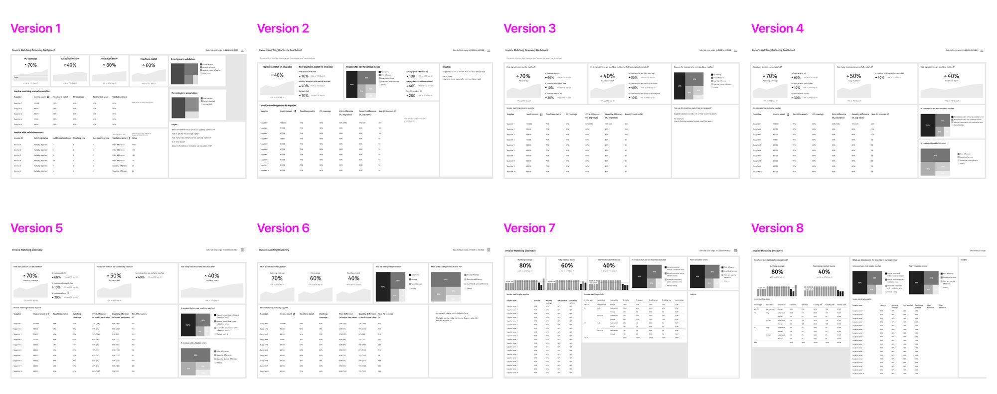
I frequently created wireframes and facilitated design discussions to enable other team members co-design the dashboard.
Below are two design challenges that I want to highlight.
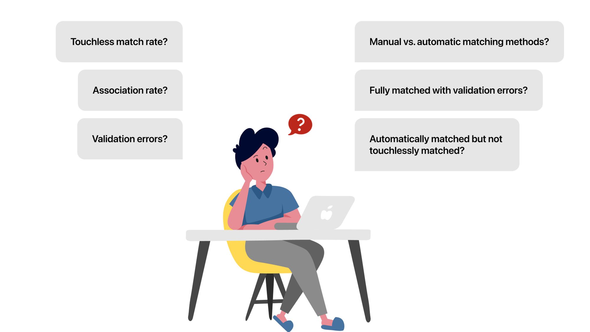
Challenge 1: How could we help users get actionable insights quickly from the dashboard?
Previously before I started working on this product, there was an Insight section on each dashboard. This section aims at providing users with critical information from the dashboard.
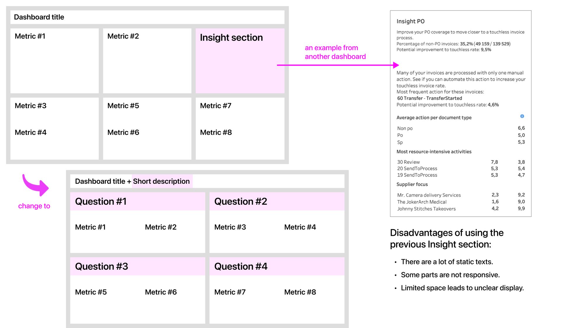
Disadvantages of the previous Insight section:
- There are many static texts, and some parts are not responsive.
- Limited space leads to unclear displays, particularly lacking titles and chart legends.
- All metrics on the dashboard should be important. Having the Insight section makes users see other metrics outside that section as unimportant, which is the wrong approach.
- Selecting the metrics to add to the Insight section is a challenge. Our team tried to prioritize the metrics, but the discussions had extended the development time significantly.
Therefore, I proposed another approach, as shown in the image above.
To provide users with actionable insights quickly, I structured the dashboard content based on the questions that users can answer by looking at the metrics under the question.
For example, being able to answer a crucial question (e.g., what prevents touchless matching) is already an important and actionable insight for AP managers. In addition, new users can understand the dashboard quickly with the question-based layout.
Challenge 2: How could we explain complex concepts to non-technical users?
Invoice matching is a complex process, including various technical concepts and overlap scenarios.
I needed to find the right balance between being too generic and too technical.
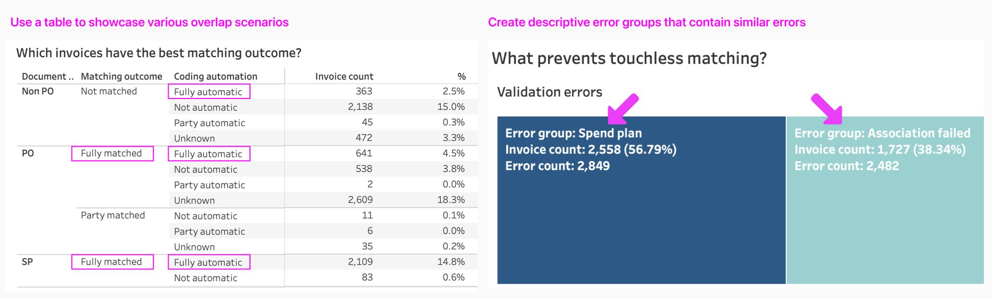
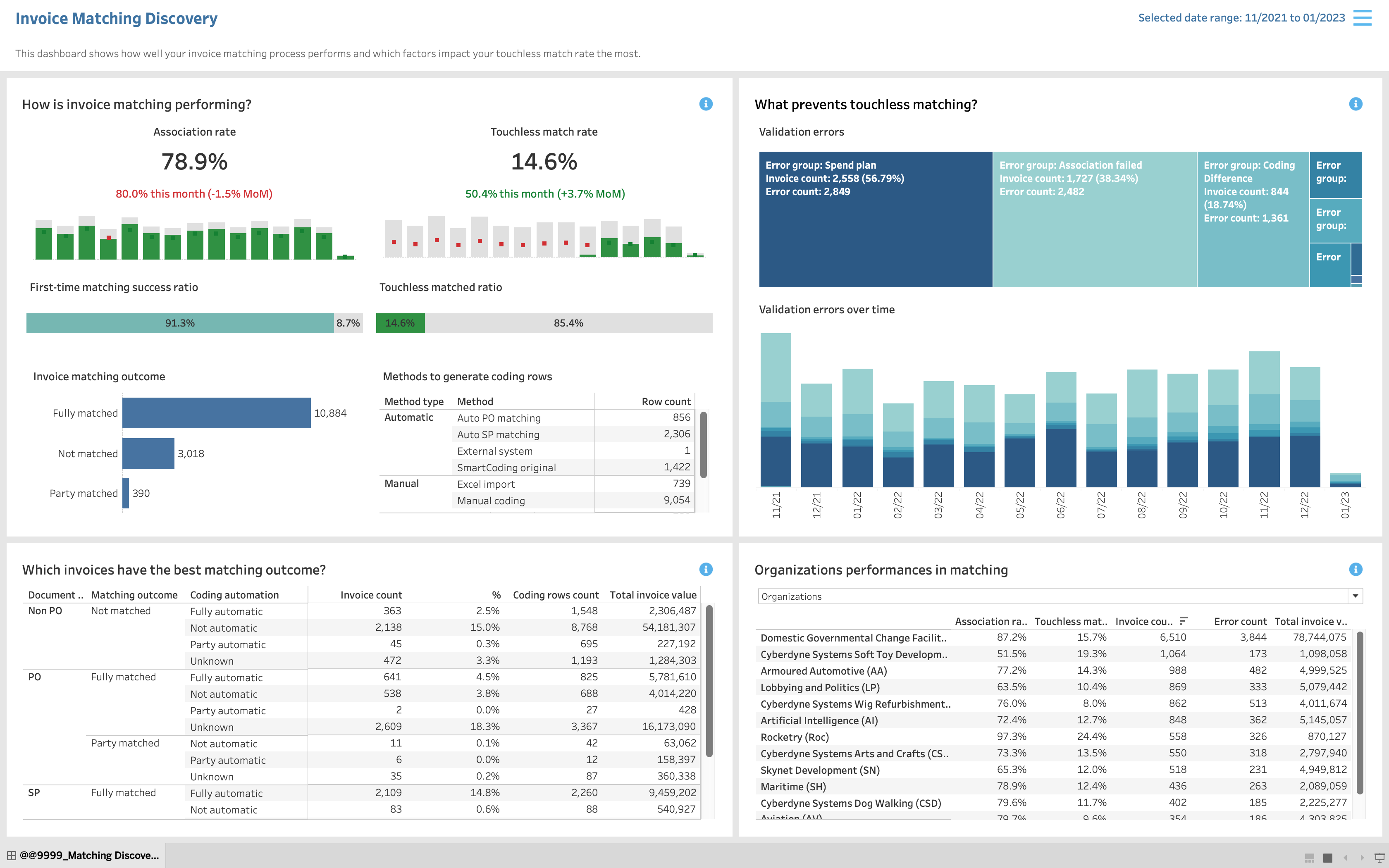
A table is used to showcase possible scenarios in matching.
Looking at the table, users can know which scenario leads to touchless matched and which areas need to be improved.
Validation errors are divided into different groups.
The group names are descriptive enough to understand, so users can quickly understand the context and take action to reduce the errors in a group.
Phase 3: Collect user feedback
Internal users were involved in the design process.
It’s challenging to conduct user research with AP managers, the target users, in B2B settings. I needed to find other types of users to collect feedback.
Fortunately, I learned that solution consultants and customer success managers at the company use the dashboard together with the end-users from the customer side.
I took the initiative to create a survey sent to potential users internally.
In the survey, participants will begin by seeing a dashboard wireframe, then they will answer some questions. These questions helped me to achieve the two research goals below.
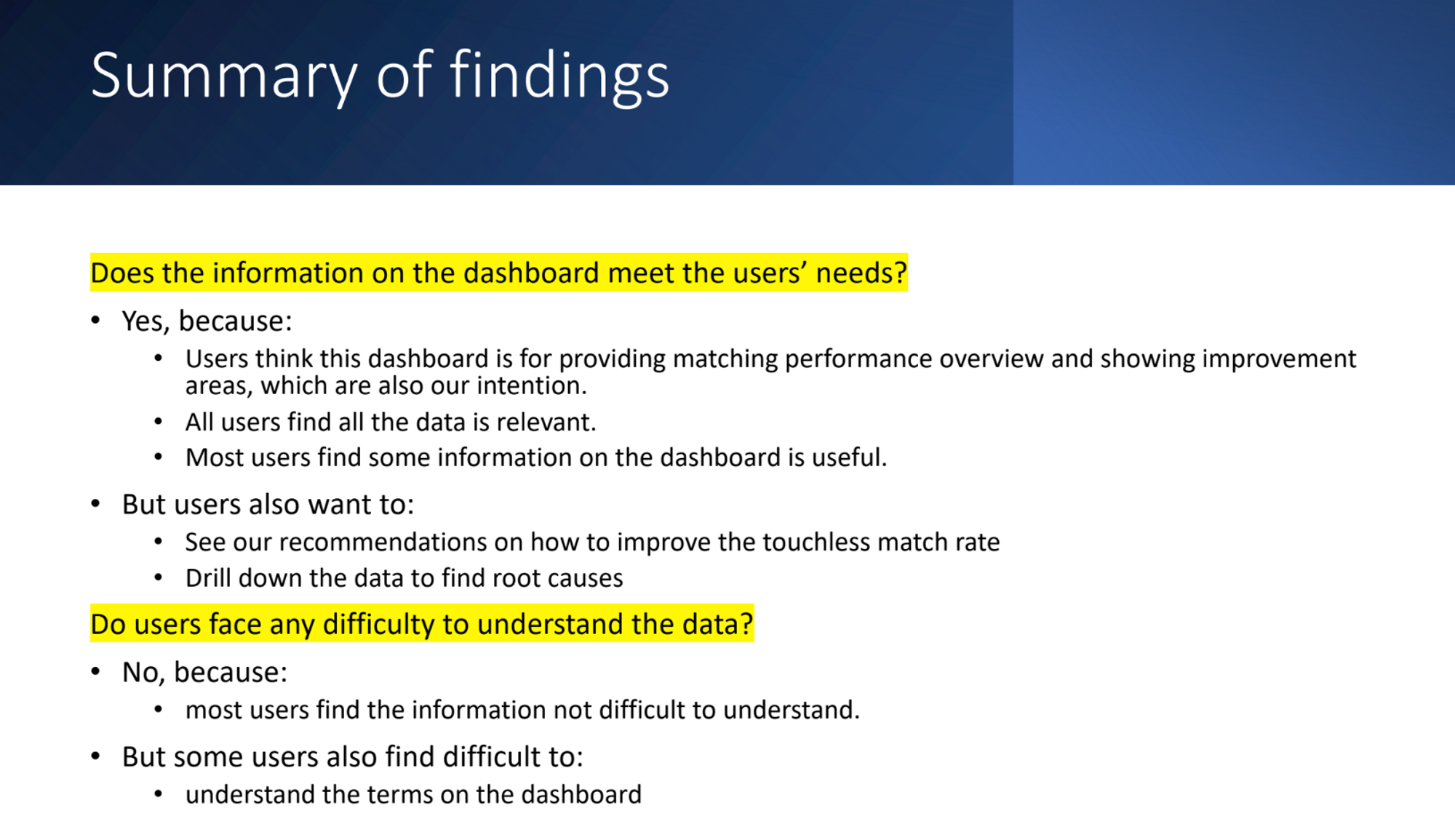
Goal 1: Validate if the information on the dashboard meets the users’ needs
- What do you think this dashboard is used for?
- Overall, how useful is the information on the dashboard to you? Users give the score 0-10
- What is the main reason for your score?
- Is all of the information on the dashboard relevant to you?
- Is there any other data that you want to see on the dashboard?
- Do you have any further comments?
Goal 2: Validate if the users face any difficulty in understanding the data
- Is any of the information on the dashboard difficult to understand?
- Could you please explain why the information is difficult to understand?
Below are the key findings.
After seeing the value of the survey, product owners in the team were very open to conducting user research activities.
Phase 4: Design and develop the dashboard
I modified the dashboard on Tableau to enable faster iterations and ensure the dashboard is pixel-perfect.
After the team had agreed on the general layout and story of the dashboard, I started to co-develop the dashboard with a data scientist.
There isn’t a design tool that allows me to create prototypes with real data at a fast pace.
After doing some research, I decided to learn Tableau to co-develop the dashboard. As a result, I saved a lot of development and hand-off time, thus enabling rapid iterations.
It took multiple iterations on various details to arrive at the final dashboard design.

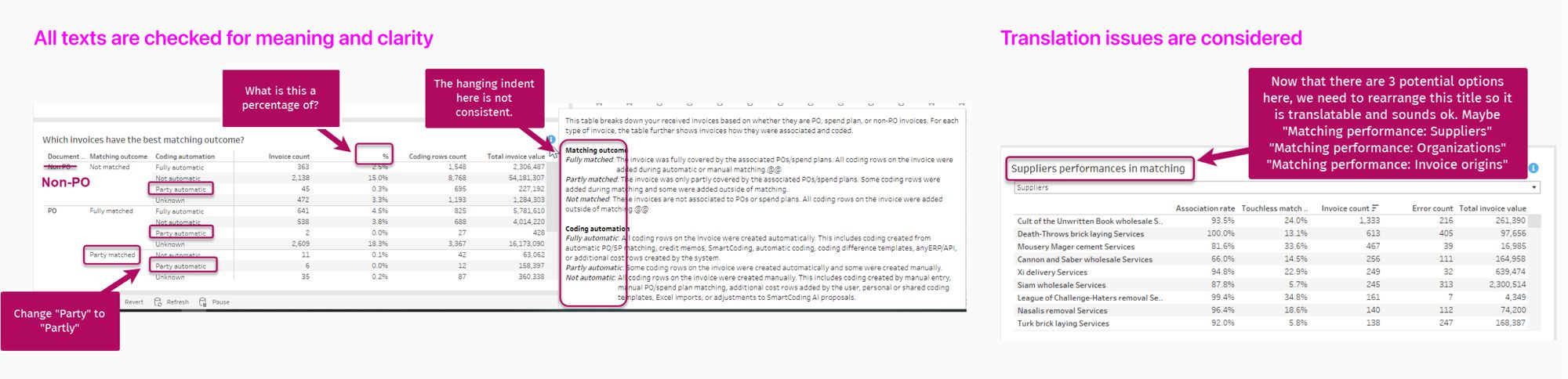
I worked with a content designer to ensure all texts were clear and understandable to users.
There are many texts on the dashboard, so having a content designer on the team was really helpful. For example, all texts on the page, tooltips, and info tips are created and checked carefully for meaning, clarity, display, and translation.
When working with a content designer, my tasks were mainly to explain the concept and implement the changes. I also gave inputs to improve the texts.
I’ve learned a lot about content design by working with a content designer.
Result
- Our team launched the dashboard and attracted many customers. When the customers see the insight to increase the automation rate, they will use our software more. As a result, analytics product becomes the priority in the company product roadmap!
- The team realized the importance of user research and advocated for it.
- I introduced a Decisions-Questions-Metrics framework that enables the team to design a dashboard effectively, especially to balance user needs and business goals.
Lessons Learned
#1: Balance the user needs and business goals in designing a dashboard
From the business view, the more metrics on the dashboard, the more value the company can sell. However, adding too many metrics to a dashboard can confuse users and distract them from important information. Thus, it is crucial to understand what actions users can take after seeing the dashboard, so the right metrics can be selected and organized to support these actions.
To achieve that goal, I developed a new framework Decisions-Questions-Metrics based on a Jobs-to-be-done framework to ideate and structure the new dashboard content. This framework is built on the thesis that a dashboard is a tool to support decision-making.
- Decisions: What decisions does this dashboard support users to make?
- Questions: What questions do users need to answer to make the decision?
- Metrics: What are metrics that help users answer the question?
This framework helps me design a better dashboard for users and help product owners prioritize the right metrics to display, saving development time. In addition, product owners can create a more appealing story based on the framework to sell the dashboard.
#2: Build user research culture in the development team
The team before me hadn’t done any user research activities. As a UX designer, I needed to show the team the value of these activities. Here is how I did it:
- I kept asking the product owner about the problems we wanted to solve for our users. The product owner was often too focused on creating new metrics and lost track of whether users needed these metrics.
- I conducted quick user tests with nearby colleagues in the office and let the product owner observe these tests. The product owner was surprised by the new insight, thus encouraging me to collect more feedback.
- I took the initiative to create a survey and launched it to potential users. Then, I analyzed the responses and proposed recommendations. Seeing the results, the product owner started to advocate for user research activities when developing the next dashboard.
#3: A designer should constantly learn about the product and new toolkits
I have seen UX designers who follow what product owners say without understanding the technical and business challenges. I think designers should learn everything, if possible, about the products to design better user experiences. I believe the more perspectives, the better the design.
Moreover, it is ok to learn new tools to support the development team. For example, I learned Tableau to co-develop the dashboard with data people, thus enabling more rapid iterations and ensuring a pixel-perfect final product.